The Commune Social | Graphics
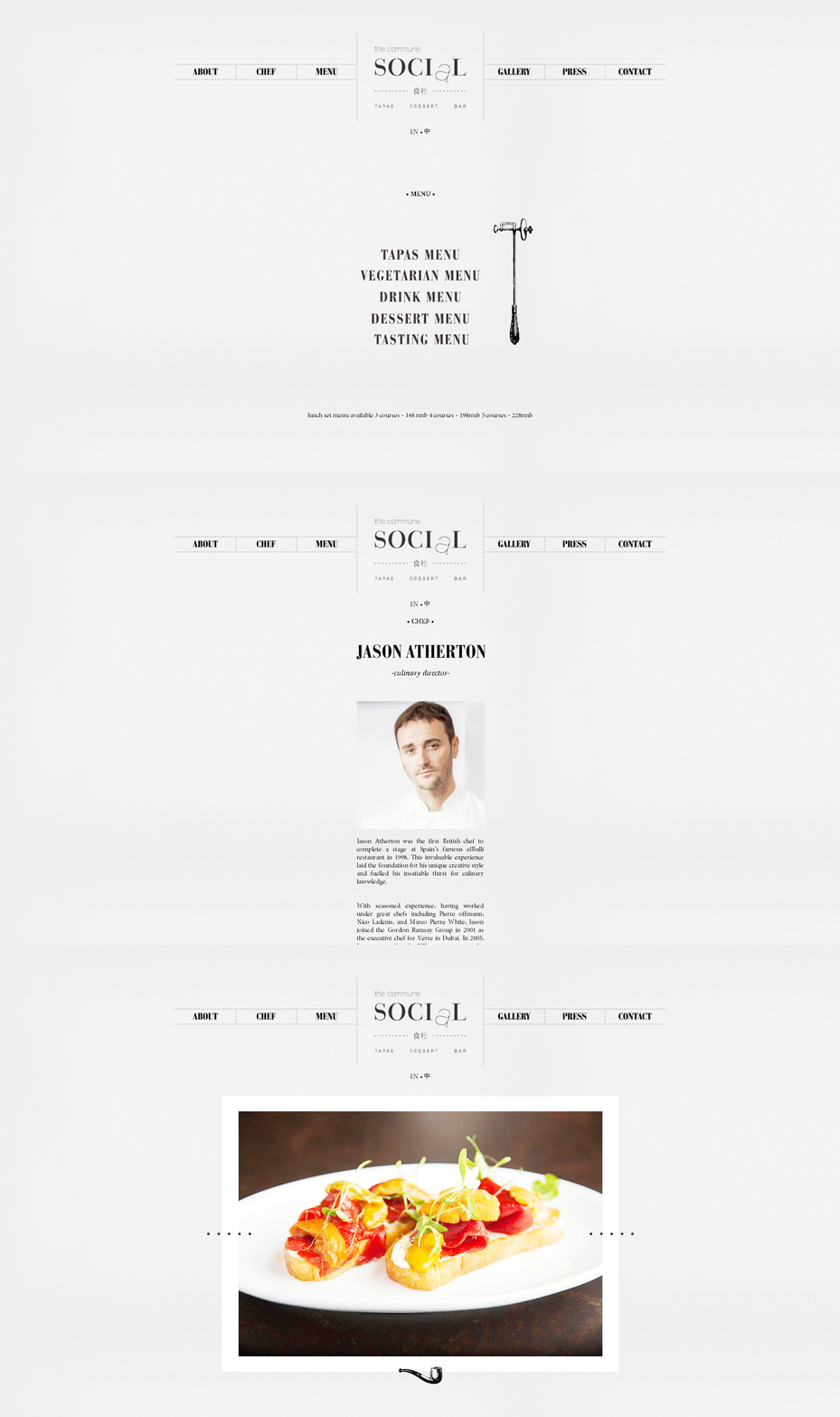
Jason Atherton’s second Shanghai outlet the Commune Social is a tapas bar located within a historical building from the 1910s Shanghai. The contrast of this historical location along with the casual atmosphere of the tapas bar guided our identity design. neri&hu decided to build upon the Jason Atherton brand adopting the same fonts from Pollen Street Social and using the dropped “a” in “social” to create an immediate link to the first of Atherton’s “Social” restaurants.
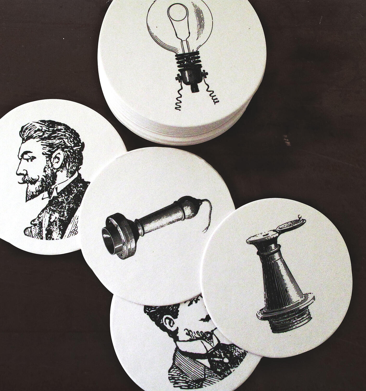
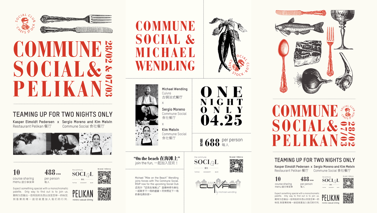
In developing the collaterals, the name of the restaurant played the main role in the concept. The graphics focus on the act of socializing, and communication. As a visual reference it uses British late 19th century illustrations --a nod to culinary director Jason Atherton’s heritage-- with elements that were present in that period, such as: telegraph, telephone, morse code, handwritten and sealed letters ....
With the collaterals of the restaurant, each item is a representation of one form of communication. The dessert menu is presented as a telegram sent from the Pastry Chef, the drink menu comes in the form of a personal address book, while the main menu printed on newsprint paper references your daily newspaper.
The store card is influenced by the architecture, its black exterior is translated into the paper color, while the treatment of the main logo is a reference to the white tiles that can be found in the interior. Staff cards are on white paper and printed with illustrations of generic people automatically gives association to the role of the card holder.
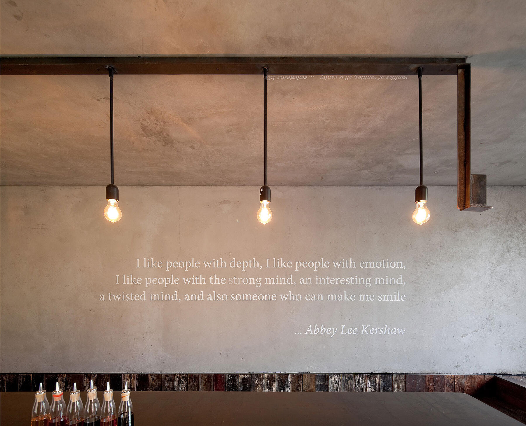
Throughout the different spaces in the restaurant are silkscreened quotes on the wall and ceiling. The randomly placed quotes speak about society and observations of the characters in it, hoping to spark social interactions between diners.
Gross Area
495 m²
Status
Complete
Completion Date
March 2013
Duration
April 2012 – March 2013
Address
511 Jiangning Road, Jing'an District, Shanghai
